Resume Thumbnail Designs
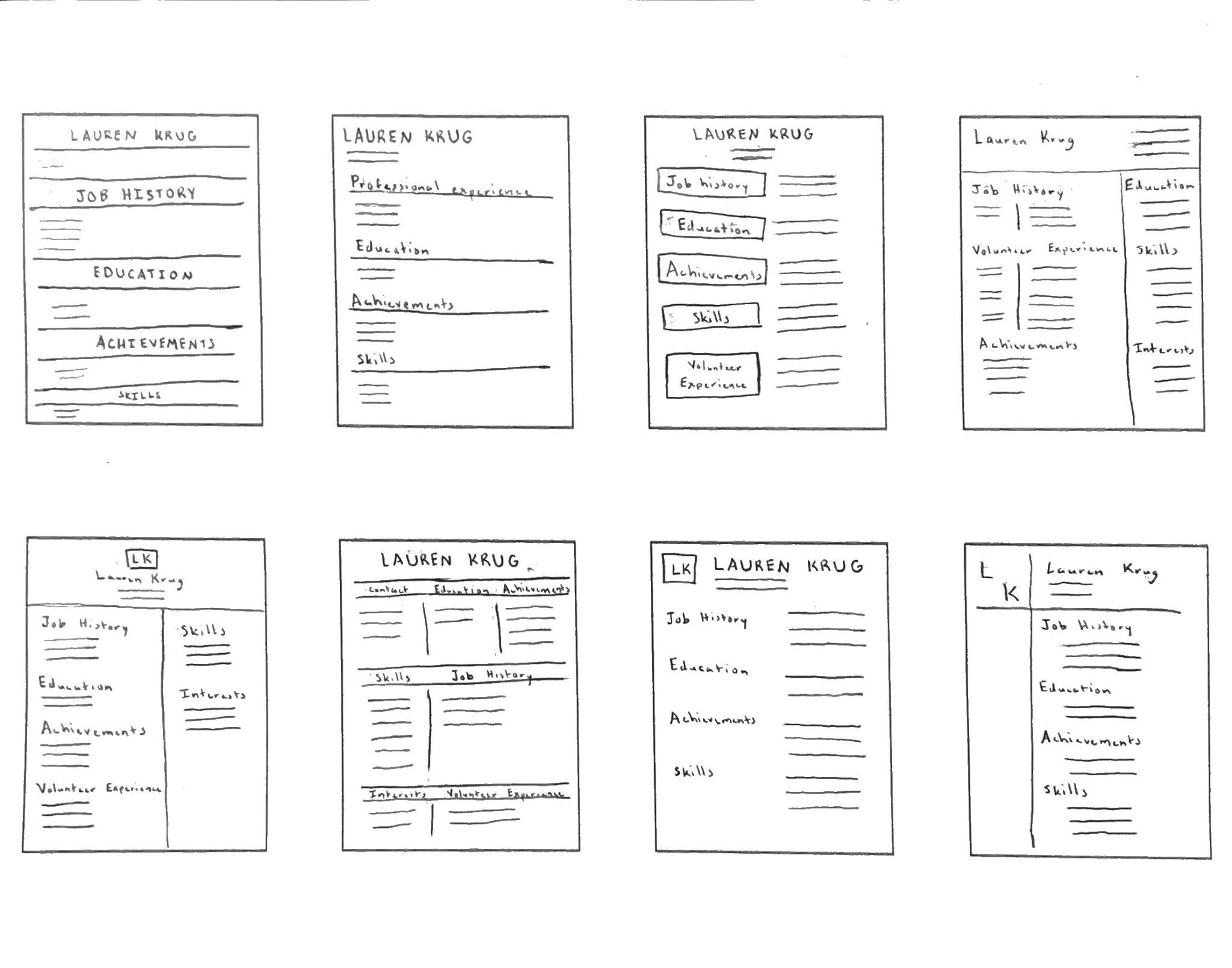
The first thumbnail is relatively basic. It contains with name centered at the top with the contact information to the left below the line that divides the information. This design uses lines to divide each section from each other. The second thumbnail is basic as well. All of the information is on the left of this design though. Also, this design uses lines to divide the sections. The third thumbnail contains name and contact information centered at the top of the page. Then, the headings of each section are in boxes with the information to the right. The fourth thumbnail contains the name to the left with the contact information on the right. The page is then divided, and the information is provided on each side. The fifth is similar to the fourth, but the name and contact information is in the center and there is a box containing initials in it above the name. The sixth contains the name centered again. The information is then divided into sections and are separated by lines. Also, the headings are placed between two horizontal lines. The seventh contains a box with initials on the top left with the name and contain information to the right of it. It then contains the headings on the left with the information on the right. The final thumbnail contains two lines that divide the page into four sections. In the top left section there are initials, and in the top right is the contact information. In the bottom right section there are the headings with the information placed below.


Hey Lauren - the thumbnails are really clean and easy to read; you're off to a really strong start with these, and any one of these may be an excellent layout to personalize towards your final. Well, done! As for the assessment, describe more of the “why” you did a design, as opposed to what the design itself looks like.
ReplyDelete